In a Twitter response to the last blog post about gas prices, @LincJosh asked
I would like to see this with a price per barrel comparison! #rippedoff
Being the geek that I am, how could I resist this.
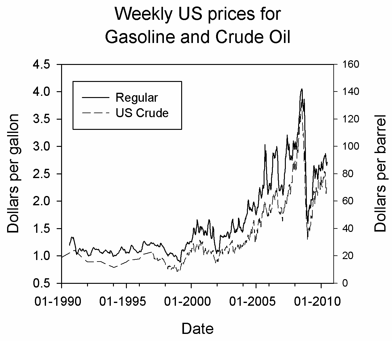
Plotted is the price per gallon of regular gasoline (solid line, left axis) and something called the “Weekly United States Spot Price FOB Weighted by Estimated Import Volume” (dashed line, right axis).
On a price per barrel basis (regular gas – solid line, US crude – dashed line),
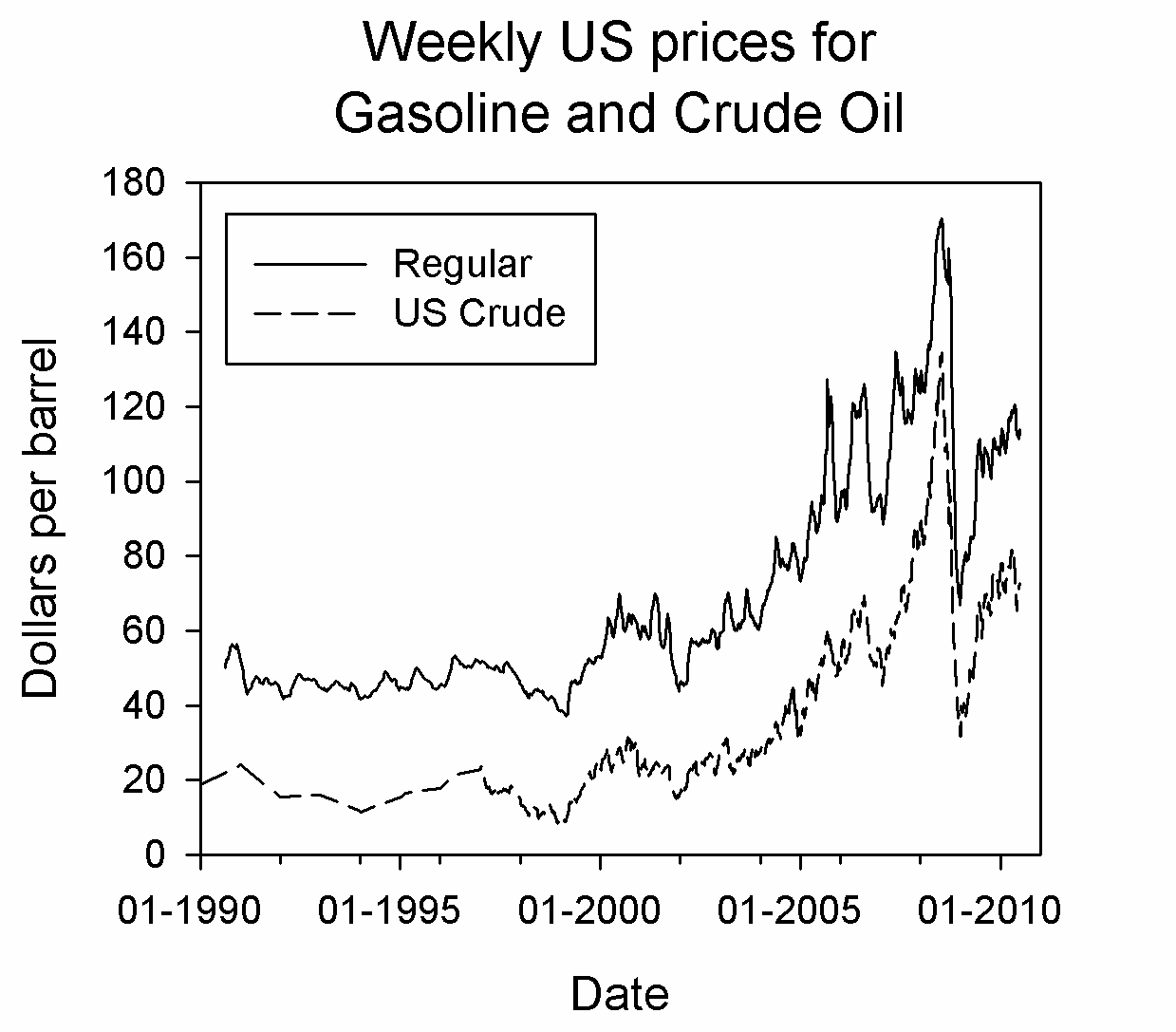
The numbers are all ripped out of Petroleum Price Database kindly provided by the US Energy Information Administration and used in its raw unprocessed form.
